Banking App Redesign
UX / VISUAL DESIGN
Citizens is a U.S. based regional bank serving millions of customers through it's mobile app. This project was a foundational redesign of the app focused on creating a modern and more accessible experience.
TIMELINE
7 months
MY ROLE
UX + UI Design for the centralized design team

THE PROBLEM
Overtime, the Citizens app had grown through incremental feature additions, resulting in inconsistent UI patterns, accessibility gaps, and a fragmented visual experience.
To meet accessibility standards and compete with leading banks, the team needed to modernize the UI and unify the product experience.

How might we modernize a legacy mobile banking app into a more accessible and user friendly experience ?
APPROACH
Designing the Foundation
I worked as part of the centralized design team responsible for defining the app’s core visual language and interaction patterns. This included:

Designing and refining core componens
Auditing existing patterns for accessibility and consistency
Developing end to end prototypes to validate the new theming, interaction behaviors, and overall experience in usability testing
Partnering closely with designers across domains to ensure the system was flexible enough to meet diverse product needs while maintaining a unified look and feel
BRAND RECOGNITION + MODERN UI
Login as the Visual Foundation
We used the login screen as a controlled environment to explore and define the app’s updated visual language. Its simplicity allowed us to evaluate foundational UI decisions, such as color usage, button styling, input fields, and quick actions.
I partnered with UX Research to test multiple design directions and found the following:
Green CTA's reinforced brand recognition and usability
Modern UI patterns shifted perception from “mobile web” to “native app.”


UX ENHANCEMENT
Quick Access Buttons
The legacy app did not have many quick actions for users to accomplish their goals in a fast and simple way. Research showed that this was an issue for users and made accomplishing their tasks feel longer.
In our redesign, we included quick access buttons across account overview screens to surface high frequency tasks and streamline navigation. This improved navigation and reduced clicks.


CUSTOMIZATION
Light and Dark Mode
Supporting display modes was a key part of making the app adaptable to different user preferences and environments. In addition to improving visual comfort for users with light sensitivity or visual impairments, dark mode allowed the experience to align with system level settings and user expectations.


ACCESSIBILITY
Dynamic Type Scaling
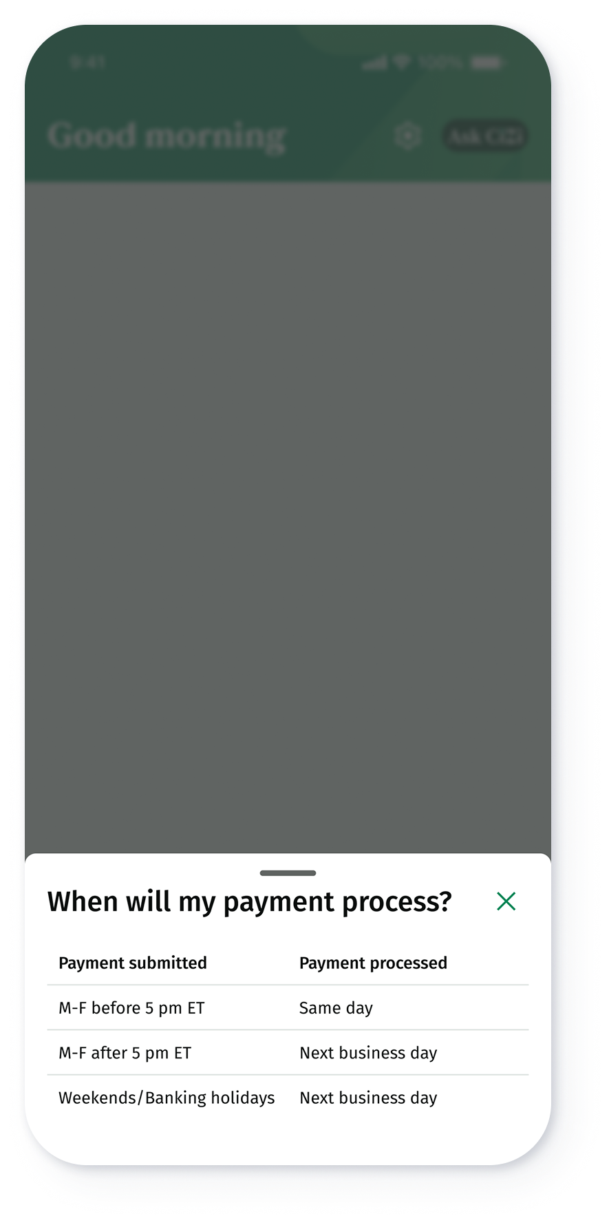
The legacy app did not support dynamic type scaling. This created accessibility barriers, particularly for users who relied on larger text sizes or have visual impairments.
The whole app now resizes font dynamically. A great example of the benefits of this effort are tables. Tables were a component we wanted to get right, to reduce usability and accessibility issues for our users. Tables are limited to 3 columns in mobile, and we ensured logic was added for tables to reflow into a vertical stack when text scaling exceeds 160%.

EMOTIONAL DESIGN
Illustration System: Concept, Collaboration, and Scalable Usage
Illustrations were introduced to add emotional resonance to the experience. They soften transactional and high-friction moments while bringing warmth and clarity to the user journey.
I led the concepting and storytelling for each illustration, defining where visuals could support usability, tone, and comprehension. I then partnered closely with the Brand team, who brought these concepts to life as production ready SVGs using the company’s visual style to stay aligned with the broader brand system. In addition, I created detailed documentation for all 40+ illustrations, covering intent, usage, placement, and guidelines to ensure they could be used consistently and at scale across the product.


Next Steps
Monitor the apps rating
Review the JD Power report once released
Conduct usability studies and review improvement on navigation and usability


